 NeutralPress Docs
UI 布局与 RowGrid
区块组件的标准布局编排方式
区块组件开发时,布局层请统一使用 RowGrid + GridItem作为外层包装。
源码位置:apps/web/src/components/client/layout/RowGrid.tsx
这个组件能自动适应桌面端与移动端,必须使用这个组件才能确保在双端显示正常。
否则你懂的,NeutralPress 是横向滚动的,与传统的网页布局完全不同。设想一下:
- 你打算在移动端创建一个宽度 100% 的组件,但桌面端横向无限制,到了桌面端变成了无限宽度。
- 你打算在桌面端创建一个高度 100% 的组件,但移动端纵向无限制,到了移动端变成了无限高度。
这个组件的设计目标是:
- 保持桌面/移动端的行为一致。
- 让所有区块共享同一套 12 分区心智模型。
- 降低后续维护成本,避免每个区块各写一套布局规则。
1. 心智模型
桌面端
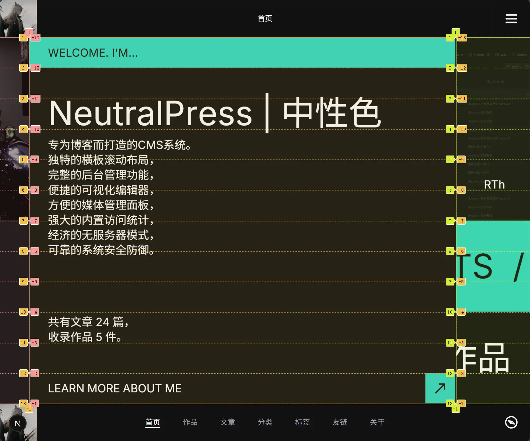
RowGrid使用grid-rows-12+ 横向流布局。GridItem.areas表示占用第几行(1..12)。width决定“宽高比例”,最终宽度由容器高度推导。
移动端
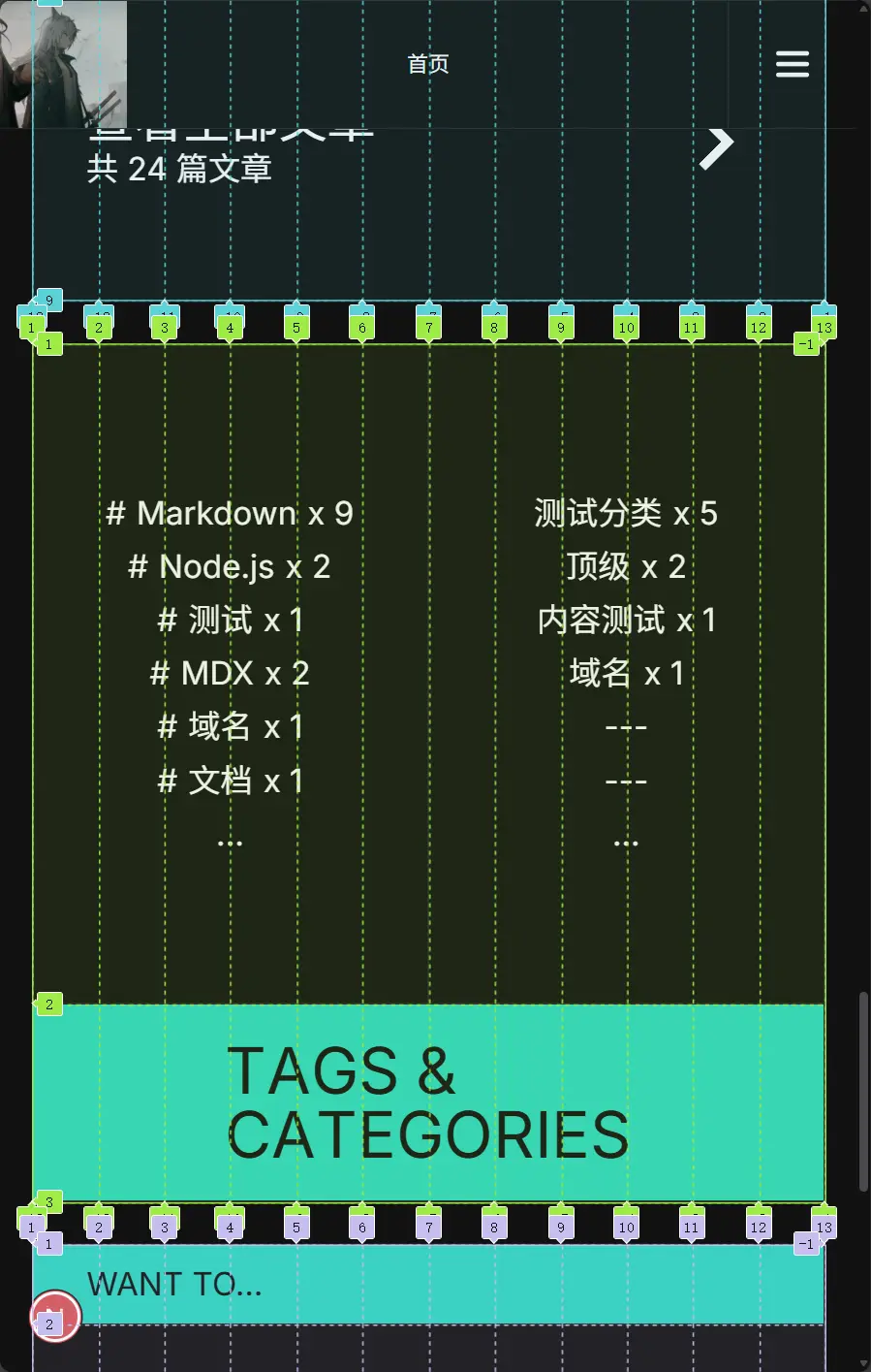
RowGrid切换为grid-cols-12+ 纵向流布局。GridItem.mobileAreas表示占用第几列(不传则默认1..12,即整行)。mobileIndex可指定移动端显示顺序(order-*)。
2. 基础用法
import RowGrid, { GridItem } from "@/components/client/layout/RowGrid";

export default function DemoBlock() {
  return (
    <RowGrid>
      <GridItem areas={[1, 2, 3, 4, 5, 6]} width={2} className="p-10">
        左侧内容
      </GridItem>

      <GridItem
        areas={[7, 8, 9, 10, 11, 12]}
        mobileAreas={[1, 2, 3, 4, 5, 6]}
        width={2}
        mobileIndex={1}
        className="p-10"
      >
        右侧内容
      </GridItem>
    </RowGrid>
  );
}
3. API 说明
RowGrid Props
-
className?: string
传递容器样式。 -
full?: boolean
桌面端启用“按比例填满宽度”模式(内部使用flex-grow分配)。
区块开发通常保持默认false,特殊全屏编辑视图才使用true。 -
style?: CSSProperties
常用于动态gap等布局参数。 -
id?: string
容器标识。
GridItem Props
-
areas: GridArea[](必填)
桌面端占用的行区域,取值范围1..12。 -
width?: number(默认3.2)
桌面端宽度比例参数。
近似计算:itemWidth = (containerHeight / 12 * areas.length) * width。 -
mobileAreas?: GridArea[]
移动端占用列区域;不传时默认整行。 -
height?: number
移动端高度比例参数,默认1 / width,以保持相同的宽高比例关系。只决定最小高度,如果内容超出会撑开。 -
fixedHeight?: boolean
true:移动端使用固定height。
false:移动端使用min-height,内容可撑开。 -
mobileIndex?: number
移动端顺序(order-*),用于“桌面横排、移动重排”。 -
className?: string
条目样式类名。
4. 常见布局模式
模式 A:头-主体-底部
<RowGrid>
  <GridItem areas={[1]} width={12} height={0.1}>
    Header
  </GridItem>
  <GridItem areas={[2, 3, 4, 5, 6, 7, 8, 9, 10, 11]} width={1.2}>
    Body
  </GridItem>
  <GridItem areas={[12]} width={12} height={0.1}>
    Footer
  </GridItem>
</RowGrid>
模式 B:桌面上下双行、移动左右双列
<RowGrid>
  <GridItem
    areas={[1, 2, 3, 4, 5, 6]}
    mobileAreas={[1, 2, 3, 4, 5, 6]}
    width={2}
    mobileIndex={0}
  >
    A
  </GridItem>
  <GridItem
    areas={[7, 8, 9, 10, 11, 12]}
    mobileAreas={[7, 8, 9, 10, 11, 12]}
    width={2}
    mobileIndex={1}
  >
    B
  </GridItem>
</RowGrid>
5. 开发建议
- 先画出
areas分区,再写业务内容,避免一边写 UI 一边改布局。 - 同一行高占比的卡片,优先统一
areas.length,便于视觉节奏稳定。 - 图片/轮播块常配合
fixedHeight,文本块通常使用非固定高度。 - 需要动画时,把动画属性挂在
GridItem子节点,不要修改RowGrid核心结构。
6. 常见错误
- 直接用普通
div取代RowGrid,导致移动端/桌面行为漂移。 areas超出1..12,或分区重叠混乱,导致排版异常。- 忽略
mobileAreas/mobileIndex,桌面可读但移动端顺序错乱。 - 把业务数据处理写进布局组件;布局组件只负责结构编排。
7. 与区块协议的关系
推荐组合是:
definition.ts声明能力。fetcher.ts产出runtime.business。index.tsx用RowGrid编排结构,用block.content + block.runtime渲染内容。
如果你新增区块并遵守这套模式,前台与编辑器渲染会更稳定,后续维护成本最低。